 Short Communication
Patternplot: Create Pie Chart, Bar Chart and Boxplot with Color, Patterns and User-defined Images in R
Shasha Bai1* and Chunqiao Luo2
1Department of Biomedical Informatics, Center for Biostatistics, The Ohio State University College of Medicine, USA
2Department of Biostatistics Core, Norris Comprehensive Cancer Center University of Southern California, USA
Shasha Bai, Department of Biomedical Informatics, Center for Biostatistics, The Ohio State University College of Medicine, USA.
Received Date: March 25, 2021; Published Date: June 24, 2021
Abstract
The pattern plot package is developed to create aesthetically pleasing and informative graphs in R. The graph types supported are pie chart, bar chart, and boxplot. Users can choose to fill pies, bars and boxes with colors, patterns, a combination of colors and patterns, or any user-defined images in .png or .jpeg formats. All graphic packages in R are able to color code categories. However, before the pattern plot package, previous graphic packages in R have either no or very limited capability in filling pie chart, bar chart, and boxplot with patterns. To the best of our knowledge, there is not any another R package, Python package, SAS/GRAPH® that has the capability in filling pie chart, bar chart, and boxplot with user-defined images. Therefore, the pattern plot package enhances the capacity of R graphing and provides users with a versatile graphic tool.
Keywords: Pattern plot; Pie chart; Bar chart; Boxplot; Pattern; Color; User defined; Image; R
Introduction
A picture is worth a thousand words. Graphic representation of study results are powerful tools when presenting scientific findings. Pie chart, bar chart, and boxplot are three of the most widely used graphic tools for data visualization. They are frequently encountered in published articles, online articles, and podium and poster presentations. A pie chart is a circular graphic, which is divided into slices to represent proportions of the whole. A bar chart plots rectangular bars with lengths proportional to the values that they represent. Pie charts are used to display counts and percentages.
Bar charts are used to display frequencies, means, median, etc. Boxplots are used to display the distribution of data by groups or categories. The concept of boxplot was first introduced by Spear in 1952 and became popular after improvement made by Turkey in the 1970s (Choonpradub and McNeil 2005) [1]. The essential components of a box plot include median (represented by a dividing line or dot), upper and lower quartiles (represented by the two end of the box), a fixed multiple of interquartile range (represented by two lines or whiskers that extend from the ends of the box), and outliers. Thanks to the availability of computer display and color printers, the use of colors has gained popularity in data visualization. Although most researchers prefer to use colorful figures because of their appeal, there is controversy regarding the use colors for publishing study results for several reasons. First, in situations where the number of categories is large, the subtle difference between many colors used becomes nearly indistinguishable and thus creates confusion. Second, for readers with color blindness, which is estimated to affect about 4.5% of world’s population (Wikipedia 2017) [2], it is difficult or impossible to read graphs with a broad spectrum of colors such as a heatmap. Last, although the number of journals that do not charge authors for color printing is increasing, many journals still charge for this service. For example, physical review journals charge authors US $1010 for a single-color figure in print and $550 for each additional color figure (Rini 2017) [3]. The cost of this service is one that needs to be considered prior to manuscript submission.
One simple solution to these problems is to use line or circle patterns, instead of colors to identify categories or groups. If a researcher is concerned about the graph being too busy, one could always use a combination of gray scale and patterns. Alternatively, one may wish to overlay gray scale or colors with a pattern to highlight a certain group or difference. Pattern in plots are available in other software environments. Python users can use matplotlib (Hunter 2007) [4] to add patterns to pie chart, bar chart, boxplot, etc. SAS users may use the PATTERN statement in SAS/ GRAPH®. Unfortunately, although R is one of the leading tools for data scientists and statisticians, there is limited capability to add patterns to plots. Functions from the pattern plot package have overcome this limitation by allowing users to add colors, patterns or a combination of both to pie chart, bar chart, and boxplot. Furthermore, user-defined images can also be added to represent categories in these types of plots. To the best of our knowledge, there is currently no other R package that has the capacity of adding user-defined images to pie charts, bar charts, and boxplots. We believe that pattern plot is an extremely useful and versatile addition to the graphing tools for researchers, statisticians, and the R user community.
Comparisons of pattern plot and Previous R Graphic Packages
Although there are numerous R packages to draw graphs, they all have limitations that de- crease their usefulness. By fine tuning the density and angle arguments, pie() and barplot() from the graphics package can add patterns to a pie chart or a bar chart. However, the pat- terns are limited to a combination of lines in different angles. Functions barchart() and bwplot() from the lattice package (Sarkar 2008) [5] can only fill bar charts and boxplots with colors but not patterns. There is no available function in the lattice package to draw a pie chart.
Table 1: Existing R functions for pie chart, bar chart, and boxplot.
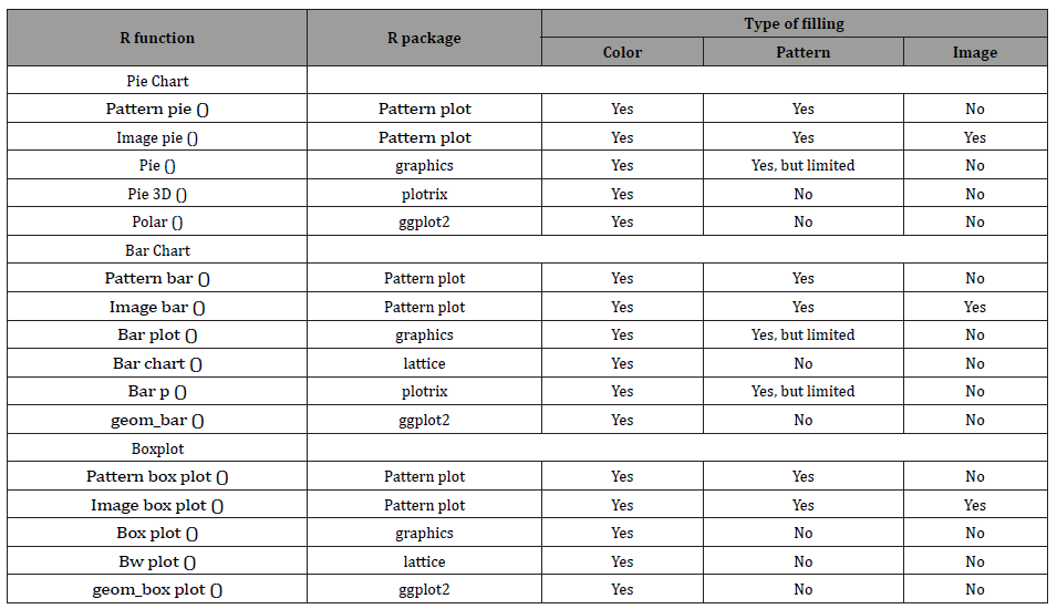
Neither plot3D() nor boxplot() from the plotrix package (Lemon, Bolker, Oom, Klein, Rowlingson, Wickham, Tyagi, Eterradossi, Grothendieck, Toews et al. 2007) [6] can add patterns to a pie chart or a boxplot. The function barp() from plotrix package can add symbols to a bar chart, but it does not allow for the use of color and symbol combinations. Functions from the well-known ggplot2 package (Wickham 2009) [2] can plot pie charts, bar charts and boxplots with colors, but they can fill them with neither patterns nor images. Al- though using functions such as annotation raster (), annotation custom() from ggplot2 can insert images into a plot, they are not tailored to draw pie charts, bar charts and boxplots. Before the development of pattern plot, there were no R functions available if a user wishes to fill pie charts, bar charts and boxplots with images. Table 1 shows the comparisons of the pattern plot and other R functions in their abilities to fill pie charts, bar charts, and boxplots with colors, patterns and images.
Package design
The pattern plot package follows a straightforward design. After reading an image into the R environment as an array with x rows, y columns and z channels, it removes values of the array, which are not in the designated polygon, thus only the partial image, which falls within the polygon, is retained. The design implementation follows four steps. In the first step, either readPNG () from the png package (Urbanek 2013) [7] or read JPEG () from the jpeg package (Urbanek 2014) [8] is used to read the images into R. The image can be from external sources such as websites or generated internally using the pattern () function in pattern plot. The read image would be in array format with x rows representing the height of the image, y columns representing the width of the image, and z channels representing either RGB if z =3 or RGBA if z =4. That is, the read image is coded as three or four numeric matrices, each with x rows and y columns. In the second step, functions from the ggplot2 package are used to plot either a pie chart, a bar char or a boxplot, and critical coordinates information from the plot were extracted. The function geom_polygon() is used for plotting a pie chart, geom_bar() is used for plotting a bar chart, and geom_boxplot() is used for plotting a boxplot. For a pie chart, the coordinates of the central point of the circle and the edges of each slice are extracted. For a bar chart or a boxplot, the coordinates of the four corners of the rectangles representing for bars or boxes are extracted. In the third step, the coordinates to each data point of the read image matrices are assigned, and then data points, which do not fall into the designated rectangles or slices are filtered out and the rest of the points are retained. The Rcpp (Eddelbuettel and Fran¸cois 2011) [9] and Rcpp Parallel packages (Allaire, Francois, Ushey, Vandenbrouck, Geelnard, and Intel 2016) [10] are used to speed up the execution of the R code in this step. In the fourth and final step, the retained image data points, edges of the polygons, and the two whiskers and outliers if it is a box plot, are plotted using functions from ggplot2. The function geom_raster() is used to plot image data points; geom_polygon() is used to plot the edges of slices; geom_ rect() is used to plot the edges of bars; geom_segment() is used to plot the skeleton of the boxplot.
The content of pattern plot
Users can install the latest version of pattern plot from CRAN. The R package pattern- plot contains six functions: image pie () and pattern pie () for pie charts, image bar () and pattern bar () for bar charts, image box plot () and pattern box plot () for boxplots. Image pie (), image bar (), and image box plot() can plot pie charts, bar charts, and boxplots using external images in .png or .jpeg format. External .png or .jpeg images chosen by users of this package will be limitless. They can be in traditional style for academic publishing, or in fancy style for fun illustrations. This unique feature of pattern plot allows users to be as creative as they can while plotting. Functions pattern pie (), pattern bar (), and pattern box plot () can plot pie charts, bar charts, and boxplots using internal images generated by internal function pattern (). Currently there are 15 pattern types available: blank, bricks, circles1, circles2, vdashes, hdashes, crosshatch, dots, grid, hlines, nelines, nwlines, shells, vlines, waves. The list can be easily extended by adding more R codes into pattern (). The pattern plot package also includes four simple data sets with values generated either arbitrarily or by simulation. Examples of pie charts, bar charts and boxplots are illustrated using these four data sets [11].
Discussion
Versatile pie charts
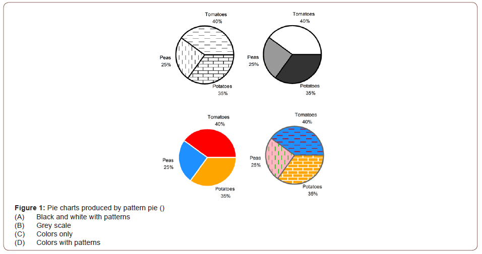
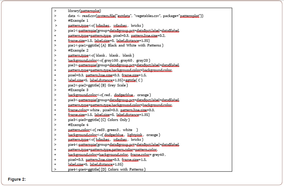
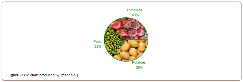

The following R code produces examples of the four pie charts in (Figure 1). Using pattern pie (), one can generate pie charts filled with patterns (Figure 1A), grey scale (Figure 1B), colors (Figure 1C), or a combination of both (Figure 1D). Users can fine tune the colors and density of patterns to achieve the best visual effects (Figure 2). The following R code produces an example of a pie chart filled with user-defined external images (Figure 3). This unique and novel feature of pattern plot sets it apart from other R graphic packages. Users can choose any images in .png or .jpeg format to fill the slices for direct data visualization (Figure 4).
Versatile bar charts
The function pattern bar () can create bar charts filled with patterns, grey scale, colors, or a combination of both. The following R code produces an example of two bar charts (Figure 5). In this example, we illustrate a situation where the number of categories is large. The difference between the colors can become visually challenging to distinguish when presented side-by-side, or even imperceptible for those with color blindness (Figure 5A). However, this inconvenience or confusion can be eliminated by adding patterns unto the bars (Figures 5B & 6)
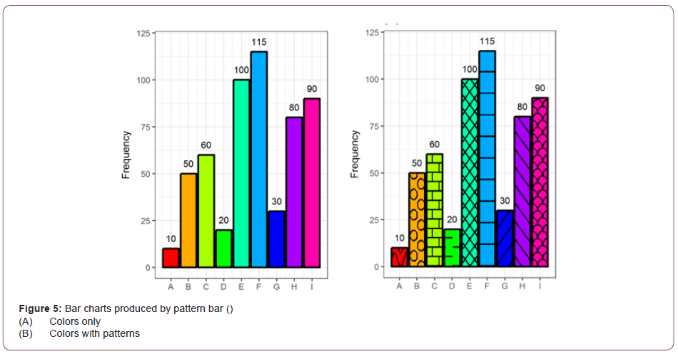
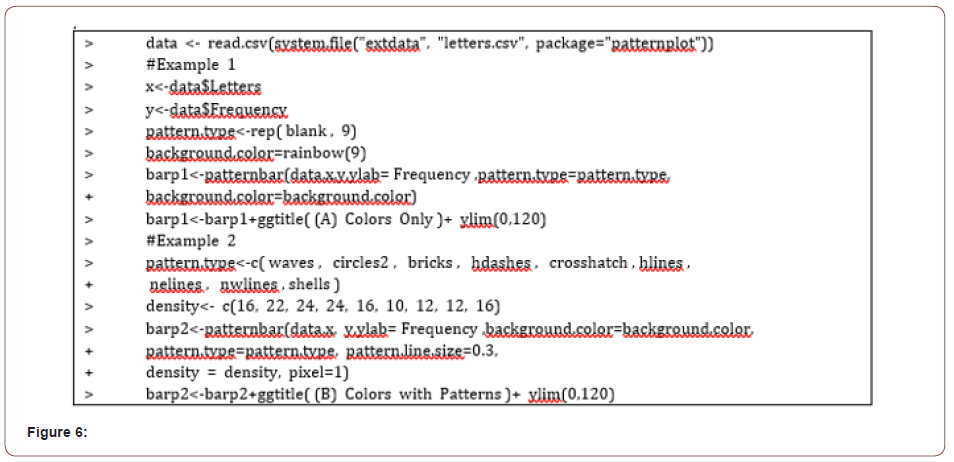
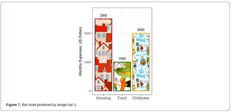
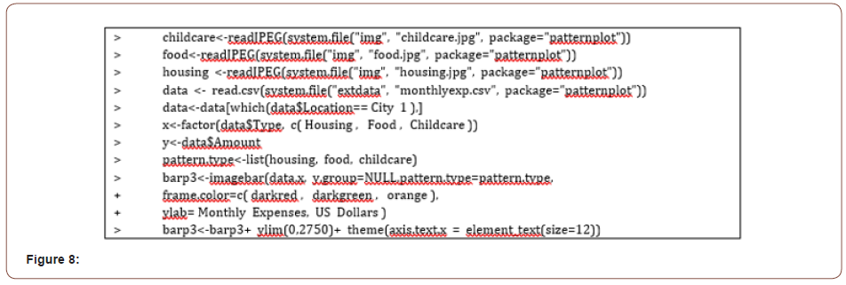
The following R code produces a bar chart filled with userdefined images (Figure 7). This is a unique and novel feature of the pattern plot package. Users can choose any image in .png or .jpeg format to fill the bars to achieve their goals in data visualization. Similarly to patternboxplot() and imageboxplot(), both patternbar() and imagebar() can make bar charts grouped by two conditions. Examples are not shown for data with two conditions (Figure 8).
Versatile boxplots
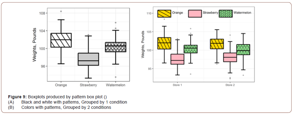
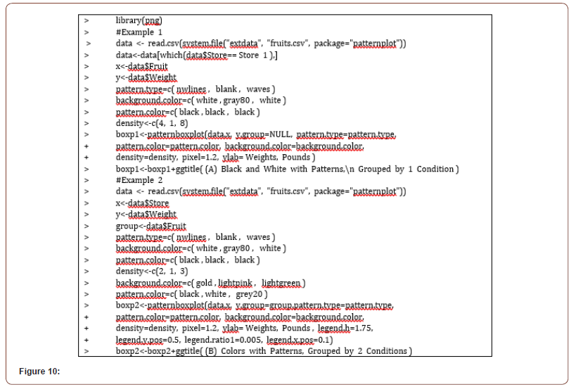
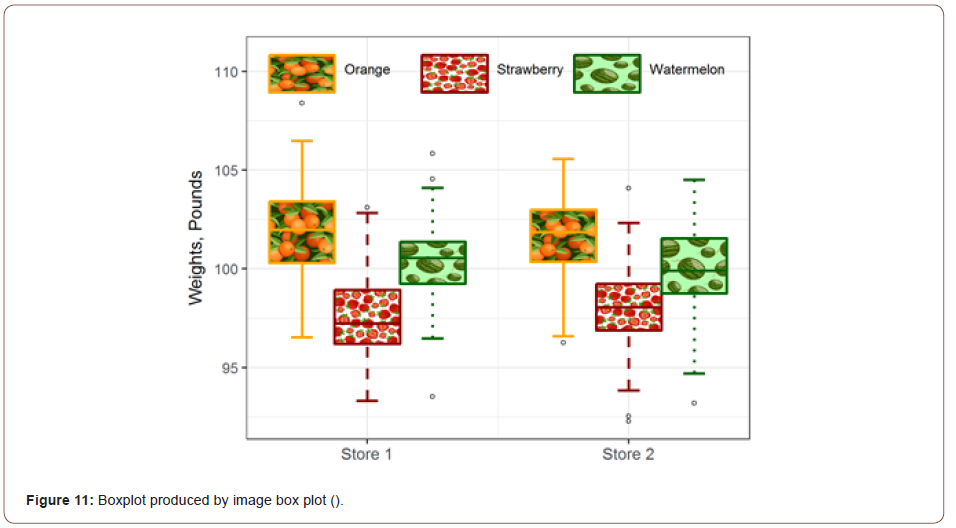
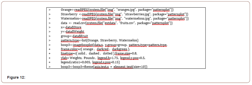
The code below produced two boxplots in (Figure 9). The function pattern box () can generate boxplots filled with patterns and colors, with either one (Figure 9A) or two groupings (Figure 9B & Figure 10). Similar to pattern box plot (), image box plot () can make boxplots grouped by either one condition (example not shown) or two conditions (Figures 11&12).
Conclusion
The returned value of all six functions in the patternplot package is a ggplot object. Thus these functions can be integrated with other functions in the ggplot2 package, such as ggtitle() and theme(). The algorithm of implemented in the patternplot package can be easily extended to create other types of plots.
In conclusion, the patternplot package provides a flexible and novel way to draw pie charts, bar charts and boxplots. The pattern series functions, which include patternpie(), patternbar() and patternboxplot(), meet the needs of filling plots with patterns in addition to colors. These functions will greatly enhance the capacity of R graphing. The image series functions, which include imagepie(), imagebar() and imageboxplot(), introduce a new way of graph displays by allowing the filling of plots with user-defined images. Not only can users of this package do traditional and professional figures using the pattern series functions, but also can they have fun and be as creative as they want using the image series functions. To the best of our knowledge, currently there is not any other R package, Python package, or SAS/GRAPH@that has this plotting feature. We believe, with its unique and distinguished capability, patternplot has the potential to open a new era in data visualization.
Acknowledgement
None.
Conflict of Interest
The authors have no financial interests or conflict of interests to report.
References
- Choonpradub C, McNeil D (2005) Can the box plot be improved. Songklanakarin Journal of Science and Technology 27(3): 649-657.
- Wickham H (2009) ggplot2: Elegant Graphics for Data Analysis Use R. Springer-Verlag.
- Rini M (2017) Color Figures in the Print Journal.
- Hunter JD (2007) “Matplotlib: A 2D graphics environment”. Computing In Science & Engineering 9(3): 90-95.
- Sarkar D (2008) Lattice: multivariate data visualization with R. Springer Science & Business Media.
- Lemon J, Bolker B, Oom S, Klein E, Rowlingson B et al. (2007) “plotrix: Various plotting functions.”
- Urbanek S (2013) png: Read and write PNG images. [R package version 0.1-7].
- Urbanek S (2014) jpeg: Read and write JPEG images. [R package version 0.1-8].
- Eddelbuettel D, Fran¸cois R (2011) Rcpp: Seamless R and C++ Journal of Statistical Software 40(8): 1-18.
- Allaire J, Francois R, Ushey K, Vandenbrouck G, Geelnard M (2016) Rcpp Parallel: Parallel Programming Tools for ’Rcpp’.
- (2017) Color blindness - Wikipedia, The Free Encyclopedia.
-
Shasha Bai, Chunqiao Luo. Patternplot: Create Pie Chart, Bar Chart and Boxplot with Color, Patterns and User-defined Images in R. 4(3): 2021. ABBA.MS.ID.000587. DOI: 10.33552/ABBA.2021.04.000587.
Pattern plot, Pie chart, Bar chart, Boxplot, Pattern, Color, User defined, Image, R, Data visualization
-

This work is licensed under a Creative Commons Attribution-NonCommercial 4.0 International License.


